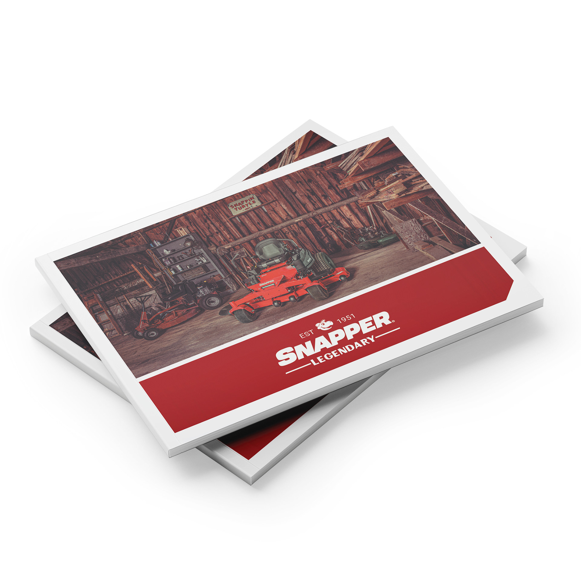
Wanting to distance itself from the “Easy to Use. Easy to Own.” slogan and its association as a low-cost big box brand, Snapper was rebranded to match its legendary roots. By playing into a retro-vintage theme, the brand now tugs on the nostalgic heartstrings of its loyal customers. A quirky tone, family-focused photography, and bringing back Sam the Snapper have reinvigorated the classic brand.

Before
After
The first step was to simplify the logo and pay homage to the brand's original logo. By breaking it down to the basics and removing the blade and drop shadow - the classic wordmark creates a straightforward and memorable image.
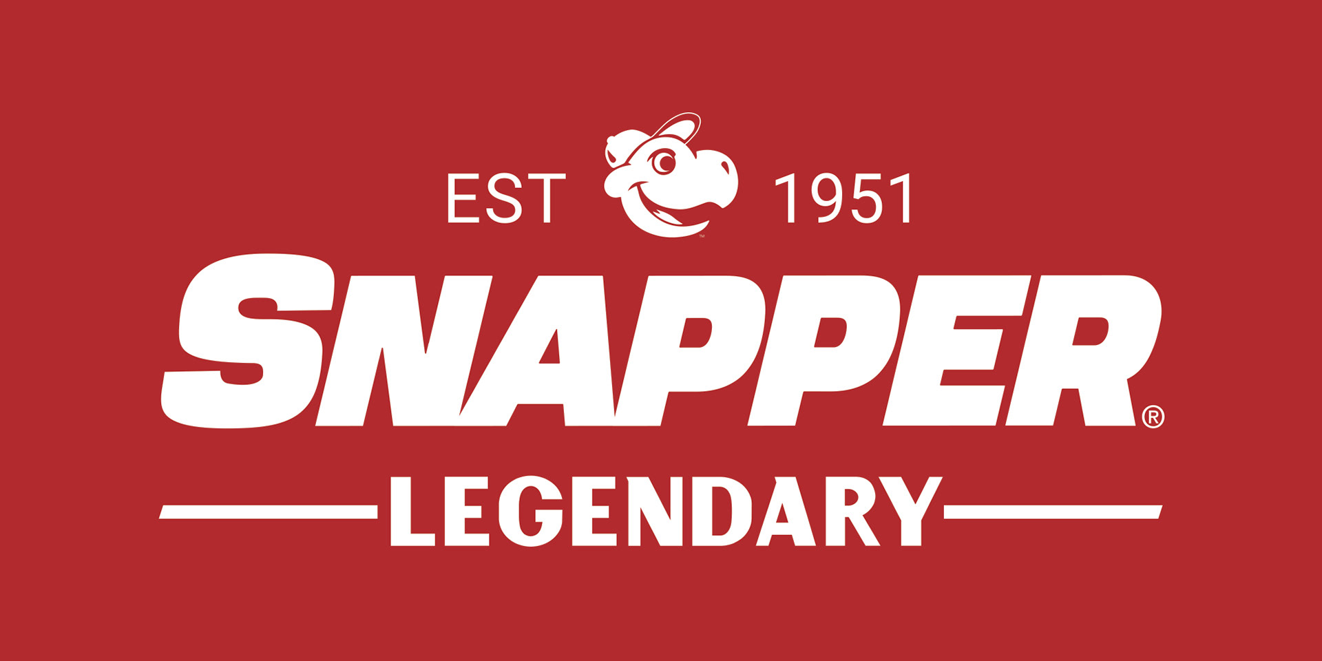
Sam the Snapper has been a classic icon of the Snapper brand since he was a hood ornament on the first self-propelled walk mower. Reintroducing Sam into the VBL has created an opportunity not only for vintage point of purchase and apparel, but also to differentiate itself in the outdoor power equipment market as one of the only brands with a mascot.

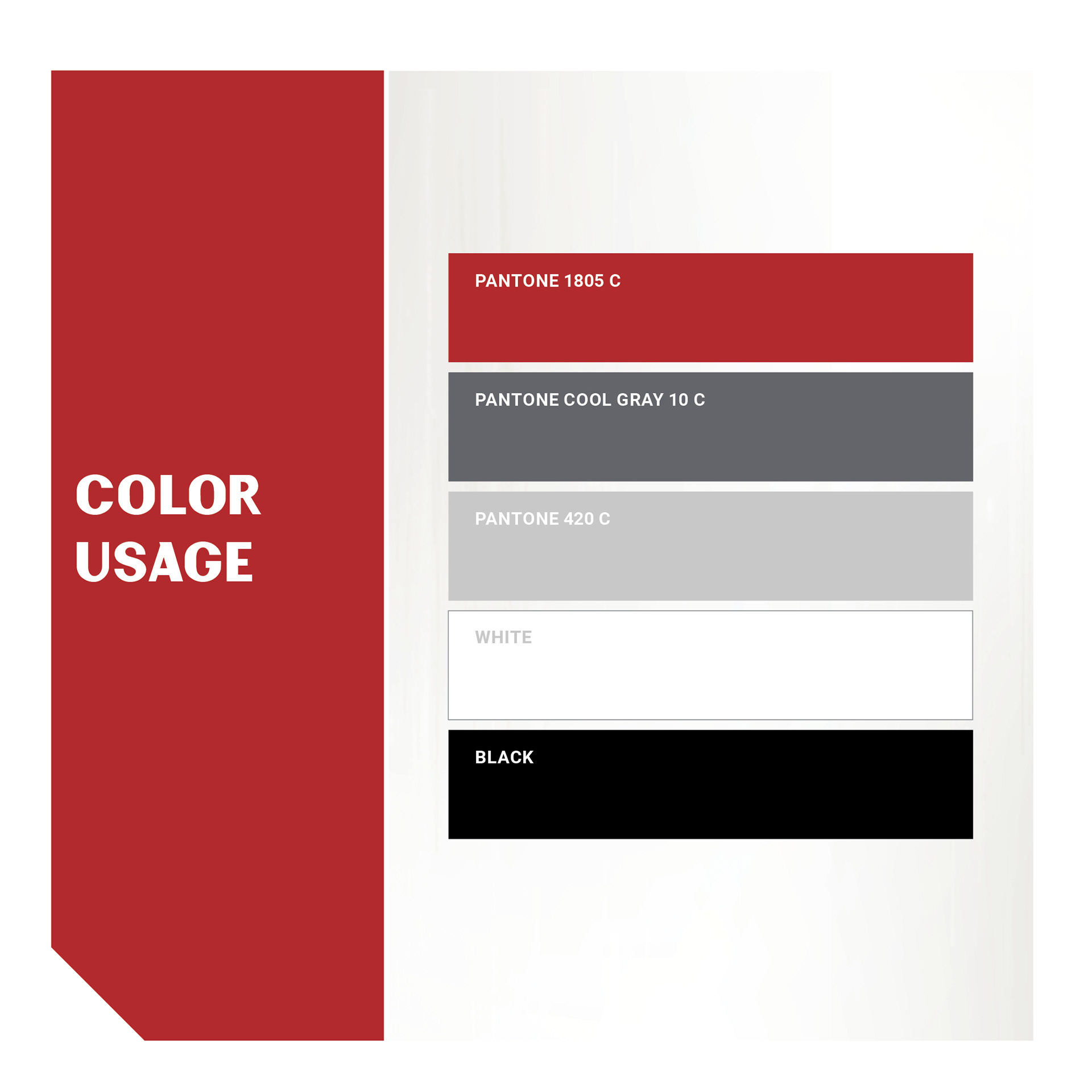

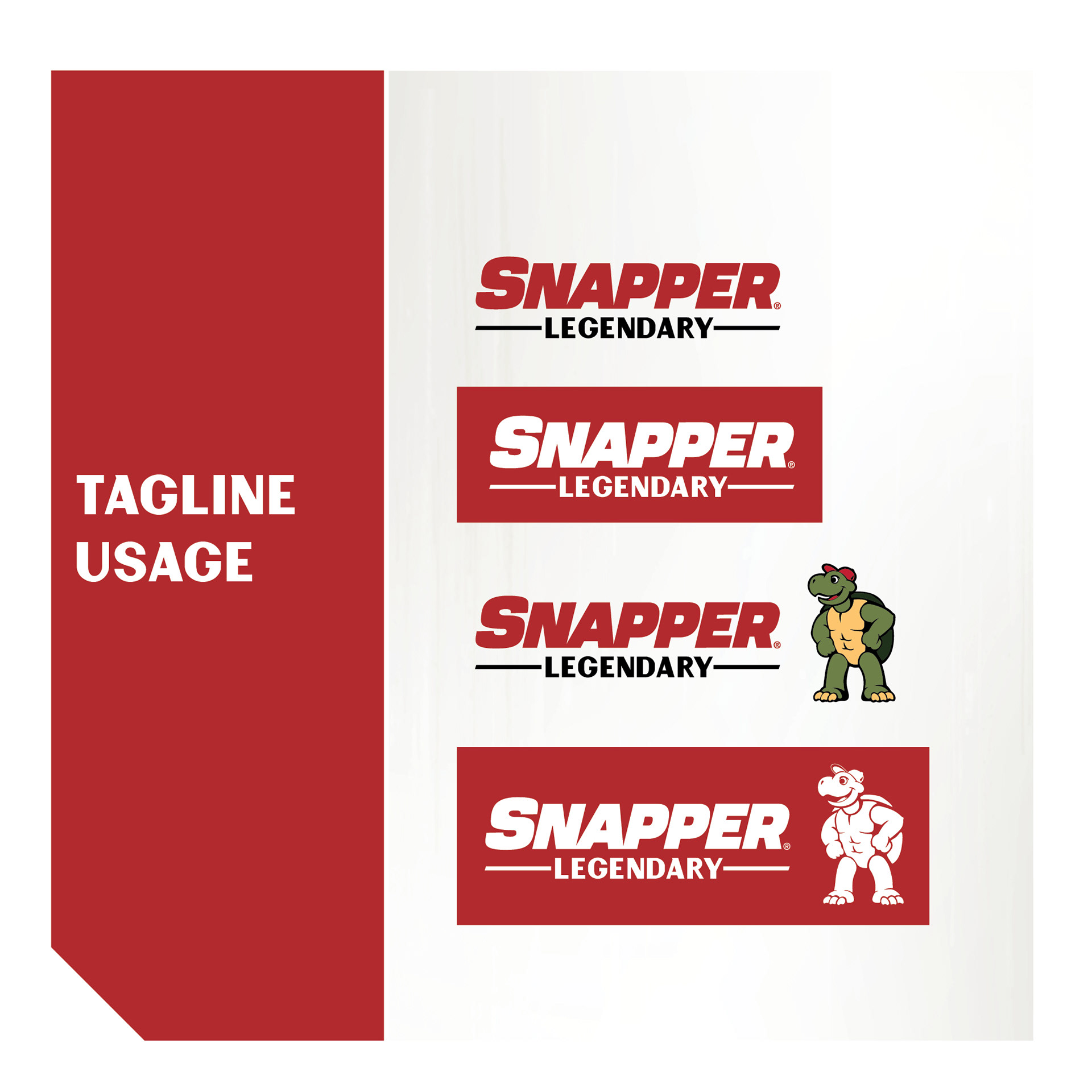

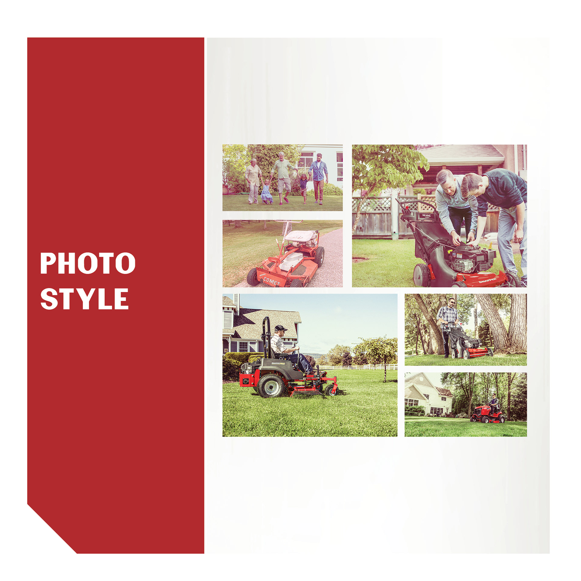
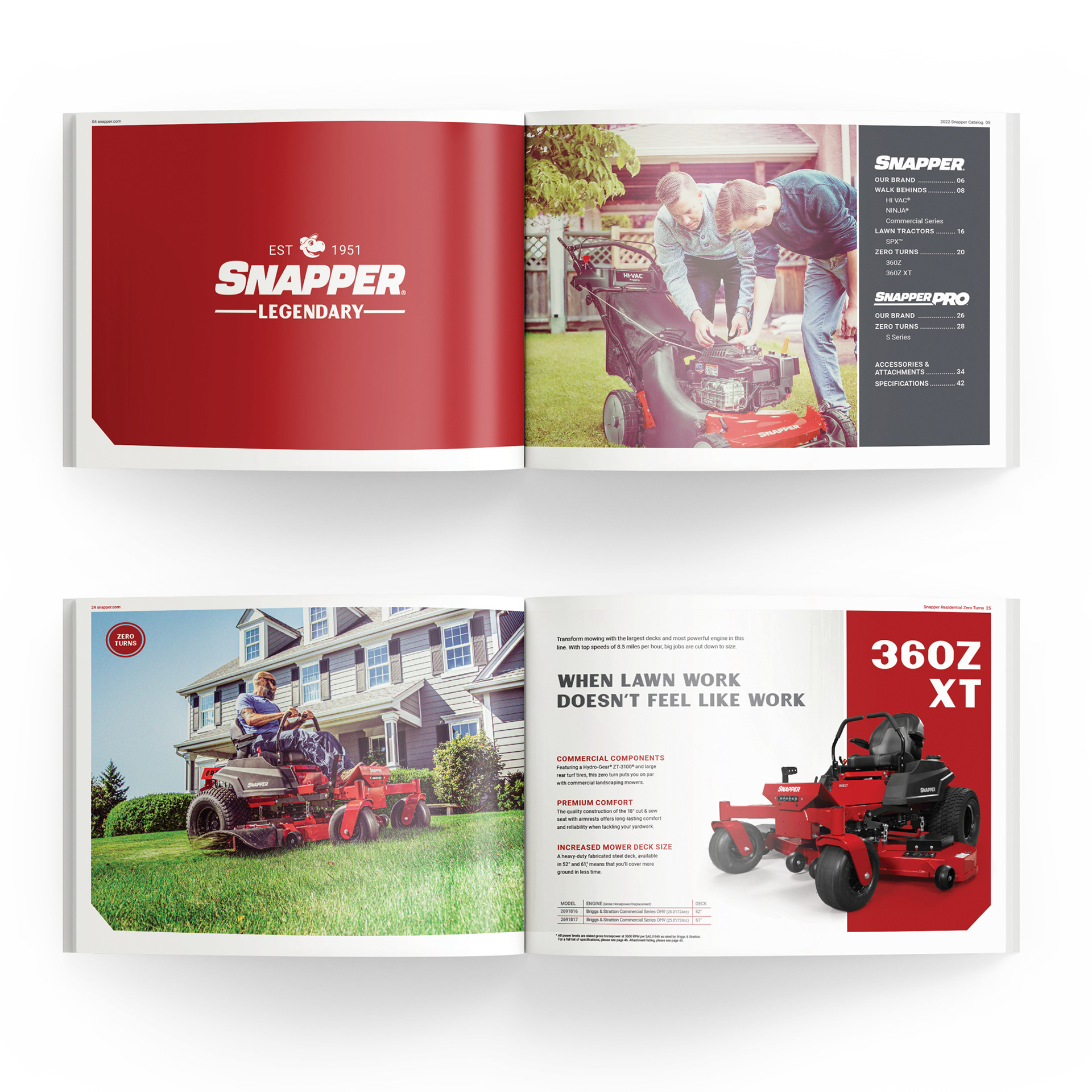
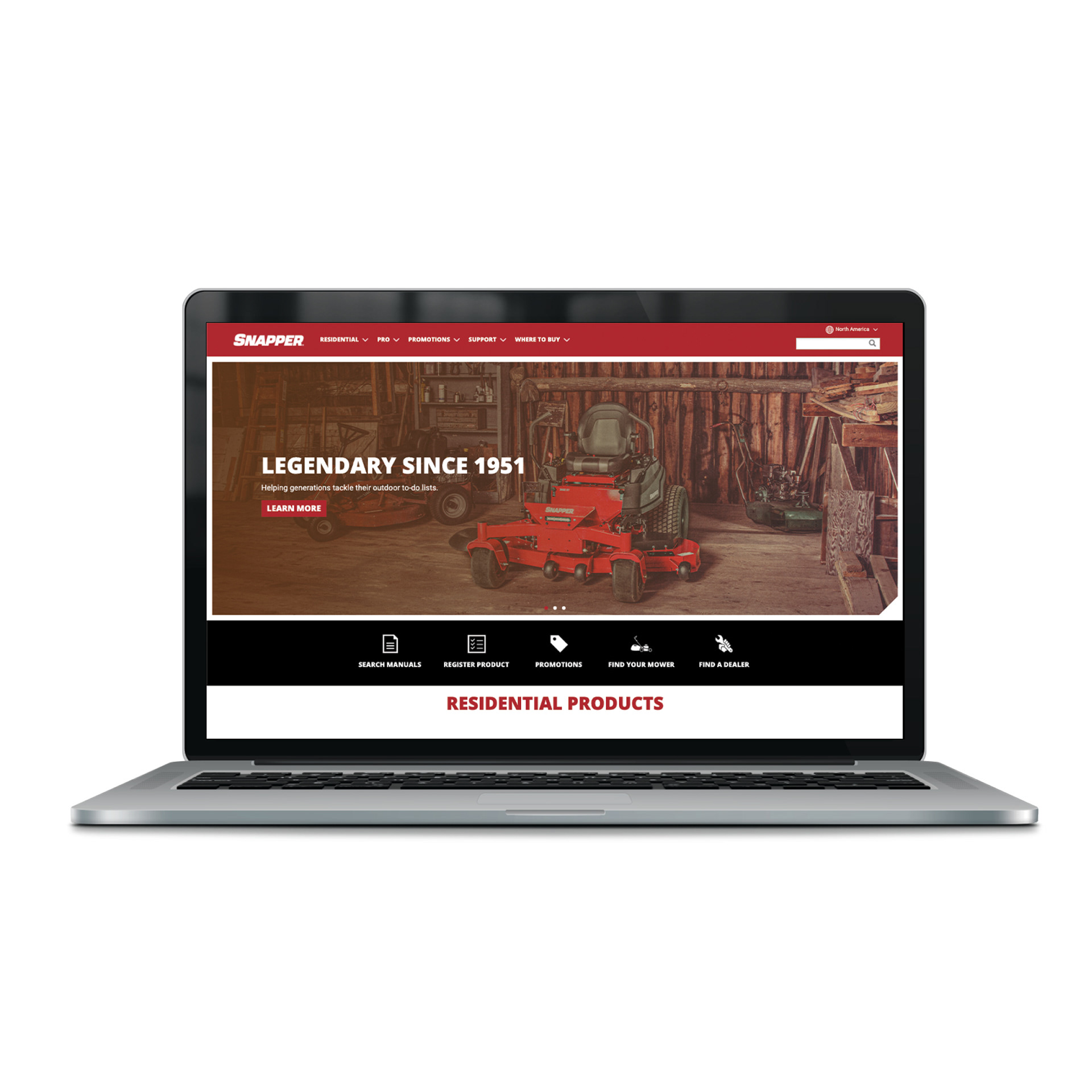
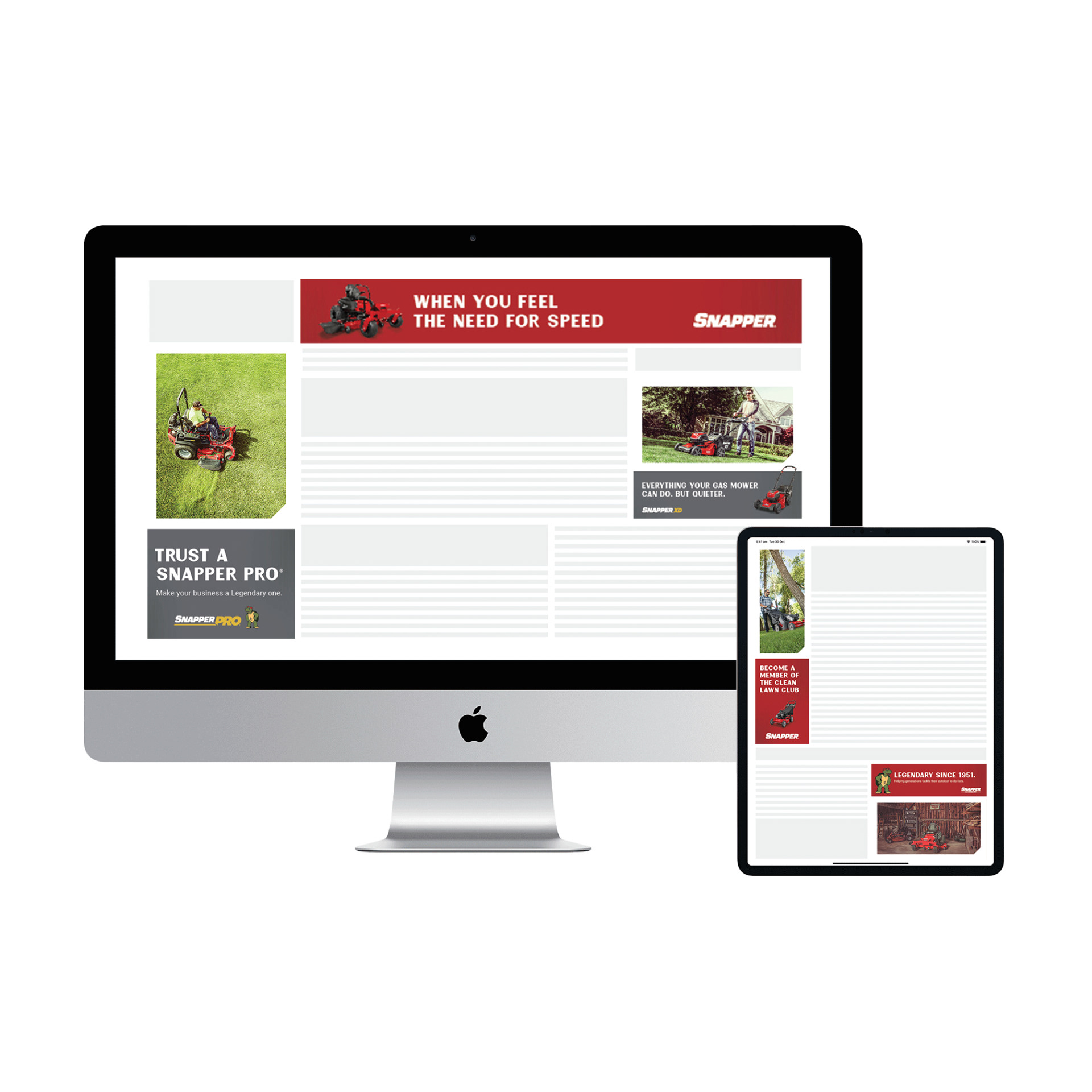
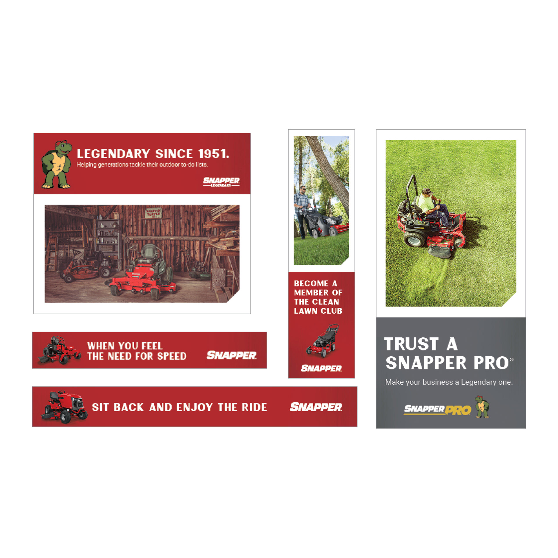
This rebrand touched across all Snapper's materials, from literature and print advertising to a new website and a digital national advertising campaign. The entirety of VBL is captured with a Style Guide and a Photography Style Guide.